⏱ 8 min read
Creating a high-converting SaaS landing page is a systematic process that combines clear value proposition, persuasive copy, strategic design, and continuous optimization. This guide from SaaS Growth Online provides a comprehensive framework to build landing pages that effectively turn visitors into trial users and paying customers, directly addressing the core challenge of SaaS marketing.

Key Takeaways
- Define a single, crystal-clear value proposition and target audience.
- Structure your page with a proven hero section, benefit-focused copy, and social proof.
- Design a frictionless user experience with a prominent, compelling call-to-action.
- Implement trust signals like testimonials, security badges, and clear pricing.
- Continuously test and optimize page elements based on data and user behavior.
What Makes a SaaS Landing Page Convert?
A high-converting SaaS landing page is a standalone web page designed with a single focus: to persuade a specific visitor segment to take a desired action, such as signing up for a free trial or requesting a demo. Its success hinges on clarity, relevance, and a frictionless path to conversion, eliminating distractions and directly addressing user pain points.
A converting page clearly communicates the core benefit of your software within seconds. It speaks directly to a well-defined audience and their specific challenges. According to industry data, pages with a singular focus outperform those with multiple messages by significant margins.
The primary goal is to reduce cognitive load for the visitor. Every element, from the headline to the call-to-action button, must work in harmony. This alignment guides the user toward the conversion goal without confusion or hesitation.
The foundation of a high-converting SaaS landing page is a laser-focused value proposition. This statement must answer the visitor’s unspoken question: “What’s in it for me?” It should be benefit-oriented, not feature-focused, and immediately recognizable.
How Do You Structure a High-Performing Landing Page?
You structure it by following a proven narrative flow that builds interest and trust. The standard approach is to guide the visitor from awareness to consideration to decision. Experts in the field recommend a logical sequence that answers questions as they arise in the user’s mind.
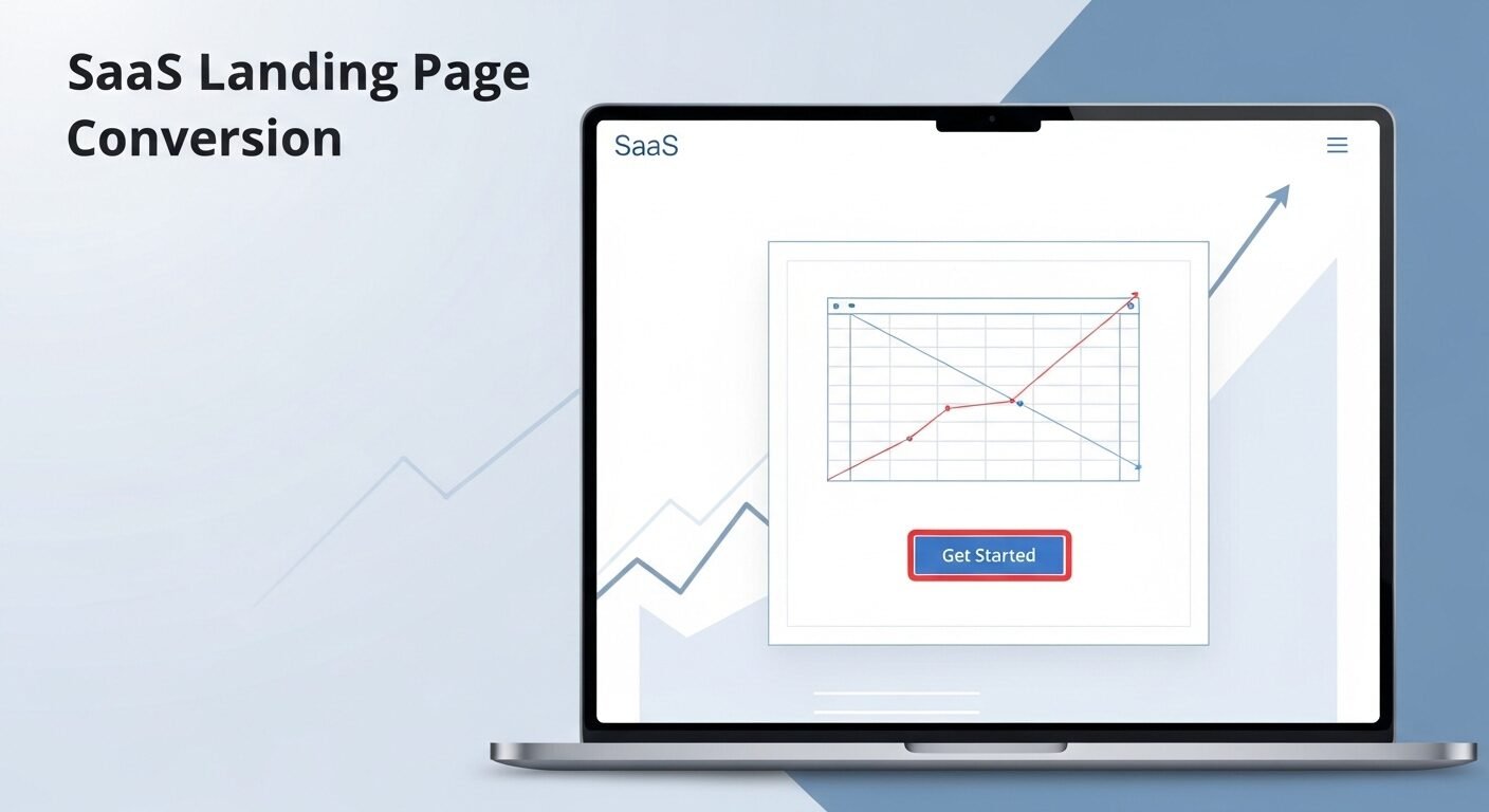
Start with a compelling hero section. This area contains your main headline, a supporting sub-headline, and your primary call-to-action. Research shows you have less than eight seconds to capture attention, so this section must be powerful.
Follow with a section dedicated to the problem you solve. Articulate the pain points your target customer experiences. This creates empathy and establishes relevance. Then, present your solution as the clear answer to those problems.
The most effective structure follows a problem-agitate-solve framework. Next, detail the key benefits and features of your software. Use bullet points or icons for easy scanning. Support each claim with evidence or a brief explanation of how it delivers value.
Step-by-Step Landing Page Creation Process
- Define Your Goal & Audience: Identify the single action you want visitors to take and the specific customer persona you are targeting.
- Craft Your Core Message: Develop a clear headline, sub-headline, and value proposition statement that speaks directly to your audience’s primary need.
- Outline the Page Flow: Map out the sections (Hero, Problem, Solution, Benefits, Social Proof, CTA) in a logical order that tells a persuasive story.
- Write the First Draft: Focus on benefits over features. Use clear, concise language and address user objections preemptively.
- Design the Layout: Create a visual hierarchy that guides the eye. Ensure ample white space, readable fonts, and a mobile-responsive design.
- Add Trust Elements: Integrate logos of clients, customer testimonials, security badges, and clear pricing information.
- Implement & Test: Launch the page and immediately begin A/B testing key elements like headlines, CTA copy, and images to improve performance.
What Copywriting Principles Drive SaaS Conversions?
You drive conversions by writing copy focused on user benefits, not technical specifications. Speak the language of your customer and address their desired outcomes. Every sentence should serve the goal of moving the visitor closer to the call-to-action.
Use clear, action-oriented language. Avoid jargon and vague claims. Instead of “leveraging synergistic paradigms,” say “saves your team 10 hours per week.” Quantifiable results are more persuasive than abstract promises.
Incorporate power words that evoke emotion or urgency, such as “simple,” “proven,” “instant,” or “guaranteed.” However, maintain authenticity. Overhyped language can damage trust. The tone should be professional, helpful, and confident.
Effective SaaS copy answers the user’s critical question: “How will this make my life or work better?” Frame features as tangible benefits. For example, “256-bit encryption” becomes “Enterprise-grade security that keeps your data safe.”
How Can Design and UX Improve Conversion Rates?
Strategic design creates a seamless path to conversion by removing friction. A clean, uncluttered layout with a clear visual hierarchy directs attention to the most important elements. Use contrast, size, and spacing to make your call-to-action button stand out.
Ensure fast loading times. A one-second delay can reduce conversions by 7%. Optimize all images and use a reliable hosting provider. Mobile responsiveness is non-negotiable, as over half of web traffic comes from mobile devices.
Use visuals that support your message. Product screenshots, demo videos, or explainer graphics can communicate complex ideas quickly. Icons can break up text and improve scannability. Color psychology can subtly influence mood and action.
User experience is paramount; every design choice should reduce effort for the visitor. Keep forms short, use auto-fill where possible, and provide immediate feedback. A confusing or slow page will kill conversion rates regardless of the offer’s quality.
| Element | Low-Converting Approach | High-Converting Approach |
|---|---|---|
| Headline | Generic company name or feature list | Clear benefit targeting a specific pain point |
| Call-to-Action (CTA) | Vague: “Learn More” or “Submit” | Action-specific: “Start My Free Trial” or “Get Instant Access” |
| Social Proof | None or generic “Loved by thousands” | Specific testimonials with names, photos, and results |
| Visuals | Stock photos unrelated to the product | Real screenshots, demo videos, or customer case study visuals |
| Form Length | Long form requesting excessive information | Short form (2-4 fields max) for initial conversion |
What Are the Essential Trust and Validation Elements?
Essential elements include customer testimonials, case studies, trust badges, and clear pricing. Social proof is critical for SaaS products, as buyers are often making a considered purchase. Seeing others succeed with your software reduces perceived risk.
Display logos of well-known clients or partners. This builds instant credibility. If you have notable investors or media mentions, feature them prominently. Security badges (SSL, GDPR, SOC 2) are mandatory for software handling sensitive data.
Offer a transparent pricing page or section. Hidden costs are a major conversion killer. A free trial or a money-back guarantee acts as a powerful risk-reversal tactic. It allows users to experience the value before fully committing.
Trust is built through transparency and proof, not just promises. Detailed case studies that show a before-and-after scenario are incredibly persuasive. They provide concrete evidence of your software’s impact in a real-world context.
How Do You Test and Optimize Your Landing Page?
You test systematically using A/B testing tools to compare variations of page elements. Start by identifying potential friction points using analytics data, such as high bounce rates or form abandonment. Form a hypothesis for improvement and test one variable at a time.
Common elements to test include headline copy, CTA button color and text, hero images, form length, and pricing presentation. Even small changes can lead to significant conversion lifts. Experts recommend running tests until you achieve 95% statistical significance.
Use heatmaps and session recording tools to understand how users interact with your page. This qualitative data reveals where users hesitate, scroll, or click. It provides context that pure quantitative data cannot.
Continuous optimization is the key to maintaining high conversion rates over time. Market conditions and user expectations evolve. Regularly reviewing performance metrics and testing new ideas ensures your landing page remains effective. A 10% improvement in conversion rate can double your revenue.
Frequently Asked Questions
How long should a SaaS landing page be?
A SaaS landing page should be as long as necessary to tell a compelling story and address all key objections. While short pages can work for simple products, most high-converting SaaS pages are long-form. They provide detailed information that builds trust and guides the visitor logically toward the call-to-action. The length should be dictated by the complexity of your offer and the buying process.
What is a good conversion rate for a SaaS landing page?
3% to 5% is a common benchmark for a SaaS landing page conversion rate, but this varies widely. Factors like traffic source, product price, and market maturity significantly impact rates. A targeted page for a bottom-of-funnel audience should convert much higher than a top-of-funnel awareness page. The primary goal is to improve your own baseline rate consistently over time.
Should I use a video on my landing page?
Yes, a short explainer or demo video often increases conversion rates. 1 in 4 visitors will watch a video if it’s prominently placed. Video can communicate complex value propositions quickly and emotionally. However, it should complement the text, not replace it. Always provide captions for accessibility and for users browsing without sound. Ensure the video loads quickly to avoid slowing down the page.
How many call-to-action buttons should I have?
You should have multiple calls-to-action, but they should all point to the same primary goal. Repeating your main CTA button in the header, within the hero section, and at the end of the page is standard practice. This ensures
1 thought on “How to Create a High-Converting SaaS Landing Page: A Step-by-Step Guide”